As we are all new to Copilot, I want to share my experience and learnings with the Copilot Microsoft 365 work or school account.
I inadvertently accessed Copilot through copilot.microsoft.com and logged in. However, I soon realized that I had not landed on my Business Standard subscription microsoft365.com Copilot homepage. Although I could generate responses from both applications, the layout differed significantly.
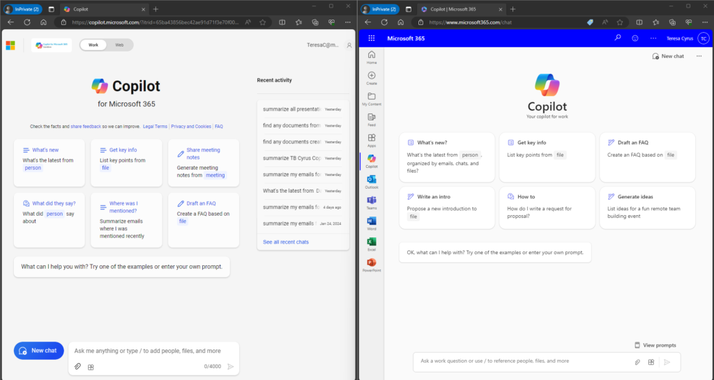
Before moving to the next paragraph, Can You Spot The Differences? The left side is copilot.microsoft.com, and the right side is microsoft365.com | Copilot. You can zoom in closer to review the image. Add the numbers of items you noticed in the comments.

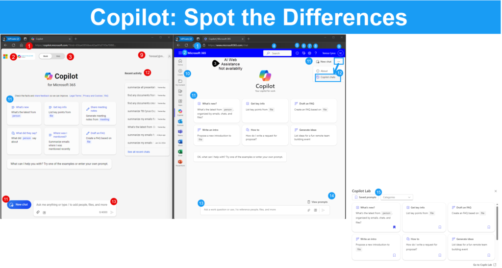
The “Copilot: Spot the Differences” image below highlights the missing features between the two Copilot for Work webpages. Share this information with your organization. This awareness may prevent some calls from the end users to IT Support.
Microsoft will likely update these pages at some point. (Probably before I can publish this article. 😁) In the meantime, here are the features available depending on the page you access.

| Copilot for Microsoft 365 | CoPilot for Work | ||
| Left Image | Right Image | ||
| 1 | Website Login | https://copilot.com | https://microsoft365.comm |
| 2 | Access to MS 365 Homepage | Contains Microsoft Logo; | Currently on Microsoft 365 home page; Contains Waffle to access MS365 Apps |
| 3 | Work/Web Tab | AI assistance is available for Work and Web (Internet); The Web Tab has a Notebook. I suggest renaming it to Web Prompt Generator instead of Notebook. Users may confuse it with OneNote. | AI Assistance for Work-related responses only; No Tab available |
| 4 | Search Bar or Icon | Not Available | Microsoft 365 Search; Searches people, files and apps, no prompts |
| 5 | Feedback Icon | Not available or could not find it | Submit Feedback to Microsoft; MS365 UI top ribbon |
| 6 | My Day Icon | Not available or could not find it | Microsoft 365 Work/School access to my calendar and To Do |
| 7 | Settings | Not Available | Microsoft 365 Work/School navigates to settings |
| 8 | Help | Not Available | Microsoft 365 Work/School standard help pane |
| 9 | Profile | Contains user’s licensed email address | Contains user’s licensed email address |
| 10 | App Navigation Pane | Not Available; Although the home page says Copilot for MS365 with Work/Web Toggle; I can not navigate to any of the MS365 Apps. Currently, this page feels like a Copilot Generator page | MS365 Work/School. I can easily navigate to my apps including Copilot homepage. |
| 11 | New Chat icon | Located on the bottom left | Located on the top right of screen. The ellipses, suggest renaming to More Options to align MS365 standard UI. |
| 12 | Prompt History | Labeled as “Recent Activity” and displayed visually on the page by default. For security purposes, please consider a fly-out. | Labeled as “Copilot Chats”. I like the fly-out function for security purposes. (Yes, I know it is an extra click. 😁) |
| 13 | Prompt Area | The number of characters is useful. As a bonus, it is not required; if the character limit is 100 characters for a better prompt, give me a green light. | I suggest adding the characters’ tally. It is useful if there is a character limit. |
| 14 | View Prompts | Not available. | Currently, it is in a nice placement by the action prompt area. I also suggest adding it to the More Options dropdown menu. |
| 15 | Copilot Lab | Not available. |


