Microsoft’s New Outlook for Windows and Web now offers 64 captivating classic and modern themes, including 10 brand-new background options. These themes are not just about changing the look. They are about personalizing your desktop window, font colors, and reading pane images to create a unique and valued desktop experience. This blog post unveils contemporary themes, as it is native to New Outlook and the Web. I will also explain the differences among the Classic, Modern, and Copilot themes.
Express Yourself with Diverse Colors and Themes
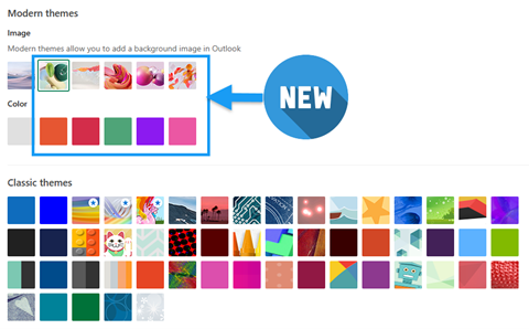
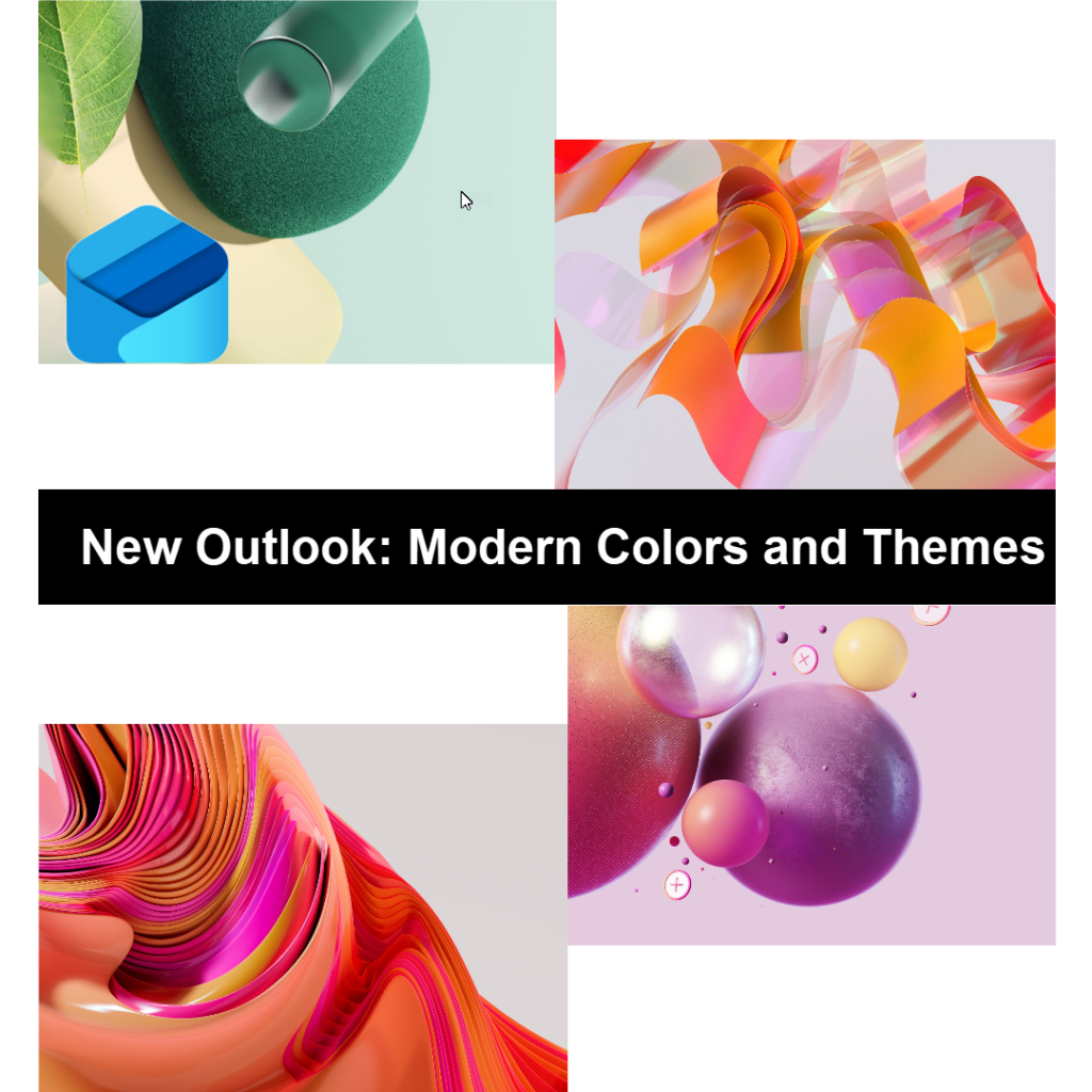
You’re now entitled to a more exciting desktop. You can choose from a Modern color palette that provides several natural or vibrant colors and images to reflect your style and mood. But don’t worry, if you prefer the Classic theme, that’s still an option. Your preferences matter, and it’s always good to have choices that cater to your unique needs.
Before you start making changes, let’s understand the behaviors of New Outlook themes.
Understand the Differences Between Choosing Colors and Themes
The Classic themes apply an image or solid color to the top header of the user interface as a banner. Also, your screen displays the chosen color in multiple ways:
Pinned items are highlighted with a shaded color to make them easily noticeable and distinguishable from other items.
Unread messages are displayed using a bold font to draw the user’s attention and indicate that they must be read.
Read messages are shown in unbold black font to signify that they have already been read and do not require immediate attention.
Active tabs are indicated by a colorful underline or vertical line to help users track which tab they are currently using.
Other subtle color changes are incorporated throughout the interface to enhance user experience and make the interface more intuitive and user-friendly.
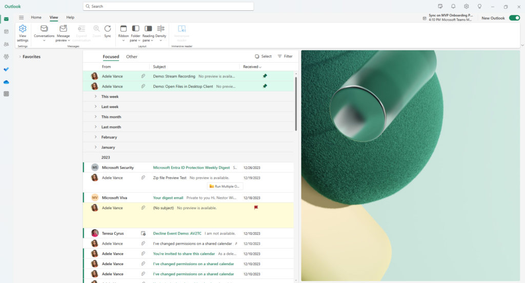
The Modern theme contains attributes identical to those of the Classic theme, except when an image is selected. When an email is selected from the message pane and the reading pane is enabled, vibrant abstract art is positioned on the reading pane. Also, the top UI banner exhibits a primary solid color based on the selection.
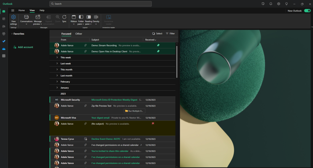
Seamless Themes Transition between Light and Dark Modes
The themes are easily interchangeable between Light and Dark modes. Whether working during the day or burning the midnight oil, you can effortlessly switch between modes to ensure optimal readability and comfort.
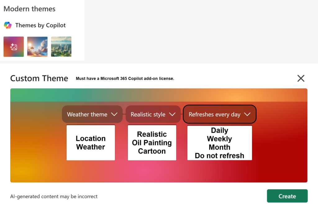
Themes by Copilot
Users with a Copilot Add-on license can generate custom themes by selecting the theme, style, and refresh frequency. If you don’t like the image, you can regenerate at any time.
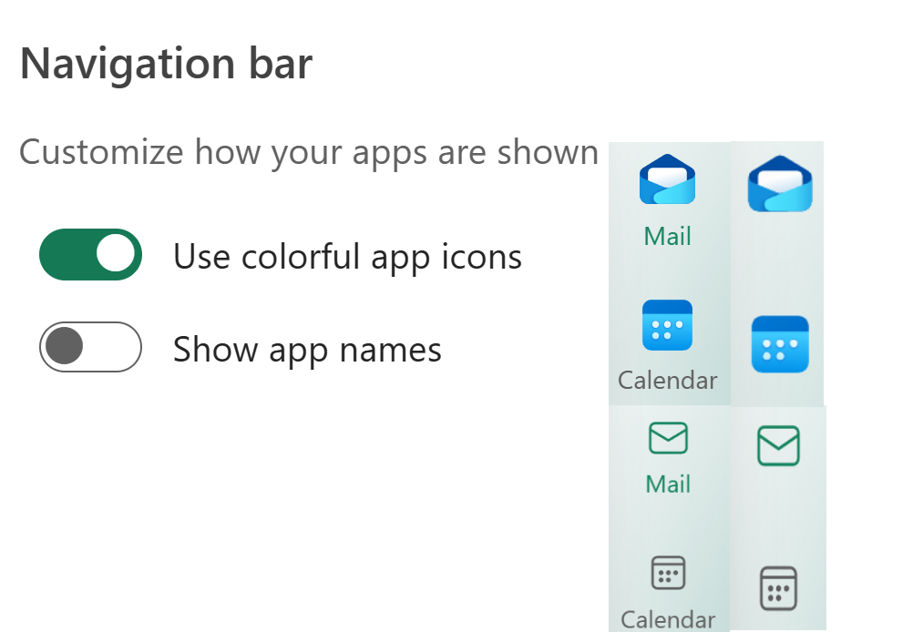
Navigation Bar in New Outlook
Because Navigation Bar settings are now grouped with Themes, I’ll cover both together.
Users can customize how app icons appear and choose whether to display app names. Keep in mind that showing app names reduces available screen space on tablets and laptops.
Note: Moving the navigation bar to the bottom—like in the Classic layout—is no longer supported.
Maximize Your Productivity with Enhanced Visuals
A customized color scheme isn’t just about style. It’s about enhancing your productivity and comfort. It can improve readability, reduce eye fatigue, and enhance your overall user experience. Whether you’re checking emails, scheduling appointments, or collaborating with colleagues, New Outlook’s themes ensure that your digital workspace is as visually appealing as it is functional, sparking a new level of excitement in your work.
Upgrade Your New Outlook Experience
To enable these exciting new themes, follow these simple steps:
Go to the View
Select View Settings from the ribbon.
Click the General tab and then Appearance.
Choose your preferred theme from the extensive collection available.
With just a few clicks, you can enjoy a fresh, colorful interface that reflects your unique style.